
In summary:
- Understand the psychological footprint of bold colors like red, which can backfire in sensitive contexts like negotiations.
- Introduce new shades methodically, starting with accessories and always testing fabric opacity for professional environments.
- Assess the visual risk of a trend; a statement bag is a safer, lower-commitment choice than a neon blouse.
- Adapt your color choices for different mediums, especially for video calls where certain hues can make you look tired.
- Deploy colors strategically throughout the week based on your professional objectives for each day.
The desire to keep your work wardrobe fresh and modern often clashes with the unwritten rules of corporate decorum. You see a trending Pantone color and want to embrace it, but the fear of looking unprofessional holds you back. Most style advice offers a simple, yet unsatisfying, solution: just add a colorful scarf or a bold accessory. While not incorrect, this approach barely scratches the surface and misses the greater opportunity to use color as a powerful tool for professional communication.
The real challenge isn’t just about adding a “pop of color”; it’s about strategic color deployment. This means understanding the psychological impact of a hue, its appropriateness for a specific situation, and the technical details of its execution. When wielded with intention, a trending color can enhance your presence, project confidence, and communicate creativity. When misapplied, it can be a distraction or, worse, send the wrong message entirely.
But what if the key wasn’t simply avoiding mistakes, but actively using color to your advantage? This guide moves beyond the generic advice to provide a strategic framework for incorporating bold hues into your office attire. We will explore the psychological footprint of certain colors, the safest ways to experiment with trends, and how to adapt palettes for different contexts, from video calls to critical meetings. It’s time to stop being afraid of color and start making it work for you.
This article provides a comprehensive look at how to master color in a professional setting. The following sections will guide you through the nuanced strategies for making trends work within your corporate wardrobe.
Contents: A Strategic Approach to Office Color
- Why Wearing Bright Red to a Negotiation Might Backfire?
- How to Introduce “Peach Fuzz” into a Grey Corporate Wardrobe?
- Statement Bag vs Blouse: Which Is the Safer Way to Wear Neon Trends?
- The Color Mistake That Makes You Look Tired on Video Calls
- When to Wear Bold Colors: The Best Days of the Week to Stand Out
- Why Painting Your Kitchen Blue Might Suppress Your Appetite?
- Why Most “Viral” Trends Die Within 3 Months and How to Spot the Real Ones?
- Seasonal Color Palettes: Which Tones Best Complement Cool Undertones in Winter?
Why Wearing Bright Red to a Negotiation Might Backfire?
Color psychology is a critical component of professional style, and nowhere is its impact more potent than in a high-stakes meeting. While red is often associated with power and confidence, deploying it in a negotiation can be a strategic error. The color’s high-energy wavelength doesn’t just command attention; it can trigger primal, defensive responses in others. Its psychological footprint is one of dominance and aggression, which can inadvertently create an adversarial atmosphere when collaboration is the goal.
The issue lies in how the human brain processes this intense hue. Sports studies have consistently shown that athletes who wear more red have a higher chance of winning because opponents subconsciously perceive them as a greater threat. This triggers a defensive mechanism, shifting the counterpart’s mindset from cooperation to self-preservation. In a business context, this can manifest as increased irritation, resistance to ideas, and a more guarded negotiation style. Furthermore, research suggests that exposure to red can increase impulsive behavior, which is a risk for all parties at the table.
Instead of red, consider deep blues or forest greens. These colors project stability, trust, and calm, fostering a more open and productive environment. The goal of “situational chromatics” is to choose a color that supports your objective. For a negotiation, that objective is a mutually beneficial agreement, not a visual declaration of war. Save the power red for a presentation where you are the sole authority, not a collaborative discussion.
How to Introduce “Peach Fuzz” into a Grey Corporate Wardrobe?
Pantone’s Color of the Year 2024, “Peach Fuzz,” embodies warmth, softness, and connection—qualities that can be a welcome addition to a traditional corporate palette of greys and navies. However, its gentle, warm nature requires careful technical execution to maintain a professional edge. Introducing a new, lighter color isn’t just about pairing it with a neutral; it’s about fabric choice, placement, and progressive integration. The key is to add warmth without sacrificing structure or authority.
The most effective strategy is a gradual one. Start with small, deliberate touches before committing to a larger garment like a blazer or dress. This allows you to test the color against your skin tone and assess its feel within your existing wardrobe. Consider a silk scarf, a leather tote, or even a pair of elegant flats. These pieces introduce the trend without overwhelming your look. When you’re ready to incorporate larger pieces, the material and its opacity become paramount. A soft, warm color like Peach Fuzz can look unprofessional in thin or transparent fabrics.
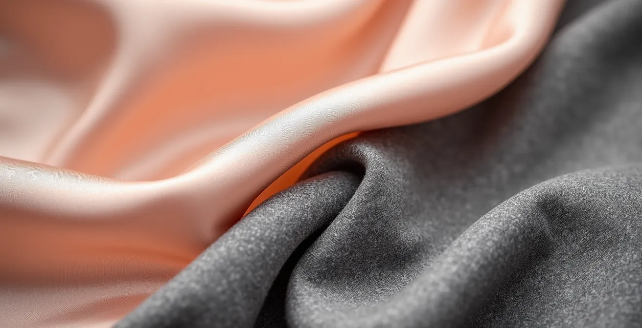
The textural contrast shown above, between a rich silk and structured wool, is a perfect example of how to make this color work. The pairing feels luxurious and intentional. To ensure your choices are office-appropriate, a thorough pre-purchase audit is essential.
Action Plan: Integrating Peach Fuzz Professionally
- Start with accessories: Begin by wearing the color in pieces away from your face, like shoes or a belt, to avoid it washing out your complexion.
- Check fabric transparency: Before buying, hold garments up to a natural light source to assess their opacity. A structured, high-quality fabric is non-negotiable.
- Perform a bend-test: For trousers or skirts, wear neutral-colored undergarments and check your reflection in natural light while bending over to ensure full coverage.
- Choose structured cuts: Opt for tailored trousers, structured shells, or lined blazers in heavier fabrics that hold their shape and prevent texture imperfections from showing through.
- Integrate with confidence: Once you’ve found the right pieces, pair them with crisp greys, deep navies, or winter whites for a sophisticated, modern corporate look.
Statement Bag vs Blouse: Which Is the Safer Way to Wear Neon Trends?
Neon colors represent the pinnacle of fashion trends—vibrant, exciting, and inherently risky in a corporate setting. Approaching such a bold statement requires a clear-eyed “visual risk assessment.” The question isn’t just *if* you should wear neon, but *how* you can control its impact. The choice between a neon blouse and a neon statement bag is a perfect case study in managing commitment levels and professional risk. A blouse is a central, constant part of your outfit, while a bag is a peripheral, controllable accessory.
As Summer Cartwright, Firstfinds Senior Editor for Elle, astutely points out, accessories are the ideal vehicle for high-impact trends. She notes that bold-colored bags function as “‘low-commitment’ pieces that can easily transition from corporate environments to after-work events.” This low-commitment nature is the key. A neon bag can be placed on the floor or a side chair during a critical meeting, effectively neutralizing its visual impact. A neon blouse, however, remains front and center, potentially distracting from your message and being perceived as unprofessional.
The following table breaks down the risk factors, making it clear why an accessory is the strategically safer choice for integrating high-risk trends.
| Factor | Neon Statement Bag | Neon Blouse |
|---|---|---|
| Professional Risk Level | Low – Can be set aside during meetings | High – Worn continuously |
| Visual Impact | Peripheral/Controllable | Central/Constant |
| Versatility | Transitions to evening events | Limited to specific contexts |
| Cost-Per-Wear Value | High – Multi-season use | Low – Trend-dependent |
| Commitment Level | Low-commitment accessory | High-commitment garment |
This analysis demonstrates that a statement accessory allows you to participate in a trend on your own terms. It offers the flexibility to dial the visual volume up or down depending on the situation, a luxury a high-commitment garment simply cannot afford.
The Color Mistake That Makes You Look Tired on Video Calls
In the age of remote and hybrid work, your on-camera presence is a significant part of your professional persona. One of the most common and subtle mistakes people make is wearing colors that are too close to their own skin tone. This creates what’s known as the “beige blob effect,” where your face, neck, and torso blend into a single, washed-out mass on screen. This lack of contrast can make you look tired, undefined, and less authoritative. The camera’s sensor struggles to differentiate between you and your clothing, leading to a flat and unengaging image.
The solution lies in choosing colors that create a clear separation between you, your clothes, and your background. You don’t need to resort to harsh blacks or stark whites. Instead, opt for saturated jewel tones like sapphire blue, emerald green, ruby red, or amethyst purple. These colors perform exceptionally well on camera, holding their richness and providing the contrast needed to make your features stand out. It’s no surprise that recent color psychology research shows that 34% of people choose blue as the most trustworthy color, making it a particularly strong and safe choice for video appearances.
To find your best on-camera colors, don’t rely on the mirror. The way a color looks in person can be very different from how it’s rendered by a webcam and affected by office lighting. The most reliable method is to record a short video of yourself wearing different tops against your typical background. This quick test will immediately reveal which colors drain you and which ones bring your screen presence to life. Always aim for a color that has a high contrast with your background to avoid blending in and ensure you command visual attention.
When to Wear Bold Colors: The Best Days of the Week to Stand Out
Strategic color deployment isn’t just about what color you wear, but *when* you wear it. Aligning your color choices with the typical energy and objectives of each workday can amplify your effectiveness. This concept of “situational chromatics” allows you to use your wardrobe to subtly influence your own mindset and the perceptions of those around you. The week can be viewed as a gradient, moving from focused, internal work to more collaborative and creative activities.
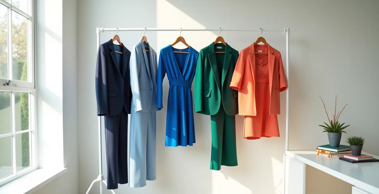
A smart weekly color strategy might look like this: * Mondays and Tuesdays: These days are often for focused, heads-down work and planning. Wearing deep, grounding colors like navy blue or charcoal grey can promote concentration and project stability. * Wednesdays: As the week’s midpoint, Wednesday is often filled with internal team meetings and problem-solving. A color like emerald green can foster balance and harmony while still feeling authoritative. * Thursdays: Energy begins to shift towards external communication and client-facing interactions. This is a good day to introduce warmer, more approachable colors like a deep berry or a warm coral to build rapport. * Fridays: The end of the week is typically more relaxed, social, and geared towards creative brainstorming or celebrating wins. This is the perfect time to deploy your boldest trend colors, like a vibrant orange or a bright yellow, to project creativity and positive energy.
Visualizing your week this way, as a progression of color, transforms your wardrobe from a collection of clothes into a toolkit for professional success. Each day presents an opportunity to wear a color that not only looks good but also aligns with your goals.
Why Painting Your Kitchen Blue Might Suppress Your Appetite?
The question of why blue in a kitchen might act as an appetite suppressant is a fascinating intersection of evolution and psychology. From an evolutionary perspective, blue is one of the rarest colors to appear in natural foods. Aside from a few exceptions like blueberries, our ancestors did not encounter blue food, and in fact, the color was often a sign of poison or spoilage. This ancient association can create a subconscious aversion or, at the very least, a lack of appetite stimulation when we are surrounded by it in a dining context.
Psychologically, blue is linked to calmness, intellect, and serenity—states that are not conducive to the more primal act of eating. While this effect might be undesirable for a kitchen, these same properties make it an exceptionally powerful color in a professional environment. The same calming influence that can dampen appetite can significantly enhance focus and productivity at work. It lowers the heart rate and creates a sensation of space and peace, allowing for clearer thinking.
This is why blue is a cornerstone of corporate wardrobes and office design. It fosters a sense of loyalty and trust while stimulating creativity. In fact, some studies on color psychology demonstrate that blue fosters creativity and out-of-the-box thinking, making it ideal for brainstorming sessions or tasks that require innovation. So, while you might want to avoid a blue kitchen, embracing a blue blazer or a blue-accented office is a scientifically sound strategy for boosting cognitive performance.
Key takeaways
- Color is a strategic tool: Go beyond aesthetics and use color to communicate intent, influence perception, and support your professional goals.
- Context is king: The right color depends entirely on the situation—the day of the week, the type of meeting, and the medium (in-person vs. video).
- Master technical execution: Manage risk with accessories, pay close attention to fabric quality and opacity, and always consider how a color works with your unique skin undertone.
Why Most “Viral” Trends Die Within 3 Months and How to Spot the Real Ones?
The fashion world is driven by a constant cycle of newness, with color trends playing a leading role. The commercial pressure is immense; after all, a Digital Hitmen study revealed that 84.7% of people chose to buy a product mainly because of its color. This creates an environment where micro-trends can explode on social media, burn brightly for a few weeks, and then vanish, leaving you with an unwearable garment. These are “viral” trends—fleeting, often impractical, and driven by hype rather than substance. They typically die within a single season because they lack versatility and broad appeal.
A “real” or sustainable trend, however, has staying power. Spotting one requires looking for deeper signals beyond social media velocity. True trends demonstrate longevity through several key indicators: * Cross-Domain Adoption: A sustainable color won’t just appear on fast-fashion sites. You’ll see it adopted by heritage brands, integrated into home décor collections, featured in beauty products, and shown on major fashion runways. * Alignment with Societal Values: Lasting trends often tap into a broader cultural mood. A color that reflects a collective desire for calm, optimism, or connection has a much better chance of resonating long-term. * Versatility and Wearability: A truly great trend color is versatile. It can be interpreted in multiple ways, works across different product categories, and can be styled for various occasions, from casual to professional.
Case Study: The Longevity of Pantone’s “Peach Fuzz”
Pantone’s Color of the Year 2024, ‘Peach Fuzz’, serves as a perfect example of a sustainable trend. Its selection was rooted in a global desire for warmth, empathy, and connection. We see its longevity indicators clearly: it quickly appeared not just in clothing but also in home furnishings, makeup palettes, and graphic design. Heritage fashion houses incorporated it into their collections, signaling its acceptance beyond the fast-fashion cycle. This widespread, multi-domain adoption is a hallmark of a trend with real staying power, making it a safer investment for your wardrobe than a fleeting viral hue.
Seasonal Color Palettes: Which Tones Best Complement Cool Undertones in Winter?
Understanding your skin’s undertone—the subtle, underlying hue beneath the surface—is the final and most personal layer of strategic color deployment. People typically have warm (yellow, peachy, golden), cool (pink, red, blueish), or neutral undertones. Wearing colors that clash with your undertone, especially near your face, can make you look sallow or washed out. This becomes particularly challenging when a warm-toned trend color, like a golden yellow or a peachy orange, is popular during winter, a season where cool-toned individuals often shine in jewel tones and icy pastels.
However, having cool undertones doesn’t mean you must avoid warm trends entirely. The key is strategic placement and balancing. The most important rule is to keep unflattering colors away from your face. You can absolutely wear a pair of warm-toned trousers, a skirt, or shoes. Pair them with a top in a flattering cool tone—like a crisp white, a royal blue, or a soft lavender—to keep a harmonious color near your face.
Another effective strategy is to find a variation of the trend color that works for you. Not all “peaches” are created equal; some may lean more pink (cooler) while others are more orange (warmer). Test different swatches in natural light to see which one complements your skin rather than fights it. Finally, you can use makeup as a balancing tool. If you’re wearing a warm-toned blouse, pairing it with a cool-toned berry lipstick can create a beautiful contrast and rebalance the overall look, ensuring you look radiant and intentional, not overwhelmed by the color.
By moving beyond simply “adding color” and adopting a strategic approach, you can transform your professional wardrobe. Mastering situational chromatics, understanding risk, and honoring your personal palette allows you to leverage trends with confidence and purpose. Start today by analyzing one trending color in your closet and asking not just “What can I wear this with?” but “What is my strategic objective when I wear this?”