In summary:
- Your foundation may look orange due to oxidation, a chemical reaction with your skin’s cool undertones.
- Successful Winter styling hinges on choosing colors with high “chromatic purity”—clear, crisp tones free of muted grey or warm yellow.
- Your specific Winter sub-season (Deep, Clear, or Cool) is determined by your natural contrast level, which dictates whether you shine in stark black or sophisticated navy.
- Even trending colors can be adapted for the office by following an 80/20 rule, using bold hues as strategic accents.
Have you ever bought a sweater in a beautiful color, only to find it makes you look tired or sallow? Or perhaps you’ve struggled with foundation that seems to turn orange on your skin within hours. These common frustrations often point not to a flaw in the product, but to a mismatch with your natural coloring. For those with the cool, high-contrast features of the Winter seasonal palette, understanding your colors is less a matter of following rules and more a science of light and reflection.
While many guides simply list “jewel tones” and “black and white” as the go-to choices, this approach misses the crucial “why.” The real key to unlocking your most radiant look lies in understanding the optical properties of color. It’s about recognizing the subtle difference between an icy pastel that illuminates your features and a muted one that flattens them, or why mustard yellow clashes while a clear lemon sings.
This guide moves beyond generic advice. We will explore the precise principles of color theory as they apply to a Cool Winter’s unique complexion. From the chemistry of foundation oxidation to the strategic use of trending colors in a professional setting, you will learn to see your palette not as a restriction, but as a powerful tool for self-expression. By mastering the concepts of chromatic purity and contrast, you will be able to build a wardrobe and makeup collection that ensures you look vibrant, polished, and effortlessly chic, every single time.
To navigate this exploration of color, this article is structured to address the most pressing questions for a Cool Winter. From foundational makeup choices to advanced styling techniques, each section builds upon the last to provide a complete and actionable understanding of your unique palette.
Summary: The Complete Guide to the Cool Winter Palette
- Why Your Foundation Always Looks Orange and How to Fix It?
- How to Select Icy Pastels That Don’t Wash You Out?
- Deep Winter vs Clear Winter: What Is the Crucial Difference in Contrast?
- The “Mustard Yellow” Mistake That Cool Winters Must Avoid
- How to Adjust Your Hair Shade to Enhance Your Seasonal Palette?
- The Color Mistake That Makes You Look Tired on Video Calls
- Why Navy Is a Better Base Color Than Black for Certain Skin Tones?
- Incorporating Trending Pantone Colors: How to Style Bold Hues for Office Wear?
Why Your Foundation Always Looks Orange and How to Fix It?
The dreaded “orange mask” is a common complaint among those with cool undertones, and the culprit is a chemical process called oxidation. When the pigments in your foundation are exposed to air and mix with your skin’s natural oils and pH level, they can change color. For Winter types, whose skin has pink, red, or blueish undertones, this shift is particularly noticeable, as a foundation that neutralizes to a warmer, more yellow or peachy tone will clash dramatically with the skin’s inherent coolness.
The challenge is that many foundations are formulated with pigments that are not stable enough to resist this change. In fact, spectrophotometry studies have confirmed this phenomenon; research tracking color shifts in foundations shows that formulations can vary significantly in their stability after application. Finding a match requires not just selecting the right shade in the bottle, but anticipating how it will perform over time on your specific skin chemistry.
To combat this, the selection process must be meticulous. First, always seek out foundations explicitly labeled with cool descriptors like ‘rosy,’ ‘cool,’ or ‘pink-based,’ and steer clear of anything marked ‘golden’ or ‘yellow.’ Testing is paramount. Apply potential shades along your jawline or neck—never your hand, which has different tones—and, most importantly, wait 10-15 minutes. This allows time for oxidation to occur, revealing the foundation’s true final color. Documenting the names of successful shades is a wise practice, as your skin tone can shift slightly with the seasons, requiring minor adjustments.
Ultimately, a perfect foundation match for a Cool Winter is one that remains true to its cool-toned nature, providing a seamless, radiant base that enhances rather than masks your natural coloring.
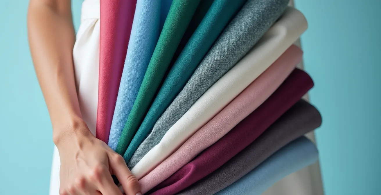
How to Select Icy Pastels That Don’t Wash You Out?
Pastels are often mistakenly thought to be the exclusive domain of the softer Spring and Summer palettes. However, for a Winter, the right kind of pastel can be breathtakingly beautiful. The secret lies in one critical distinction: icy versus muted. An icy pastel is a color with high chromatic purity—think of pure white with just a single, clear drop of pigment added. It contains no grey, beige, or dusty undertones, resulting in a crisp, vibrant, and light hue.
These icy tones, like frost lavender, glacier blue, and ice pink, harmonize with a Winter’s cool, clear coloring because they share the same high-contrast, un-muddied characteristics. They reflect light cleanly, illuminating the skin without creating a sallow or draining effect. In contrast, a muted pastel, like dusty rose or powder blue, contains grey or brown undertones that absorb light and create a soft, gentle effect. On a Winter, this softness clashes with their natural crispness, making the skin appear flat and the color look dull.

As you can see, the texture of the fabric also plays a role. Materials with a natural sheen, such as silk, satin, or crisp organza, further enhance the “icy” quality by reflecting more light, making them ideal choices for a Winter’s wardrobe. The key is to seek out pastels that feel sharp and electric rather than soft and chalky.
This comparative table clearly illustrates the difference in effect. Sourced from an analysis from The Concept Wardrobe, it breaks down how to identify the right pastels for your Winter palette.
| Color Type | Icy Pastels (Recommended) | Muted Pastels (Avoid) | Visual Effect on Cool Winters |
|---|---|---|---|
| Pink | Ice pink (pure white + hint of pink) | Dusty rose (pink + grey) | Icy creates brightness, muted appears dull |
| Blue | Glacier blue (white + clear blue) | Powder blue (blue + grey) | Icy enhances coolness, muted flattens complexion |
| Purple | Frost lavender (white + pure purple) | Mauve (purple + brown/grey) | Icy adds vibrancy, muted creates sallow appearance |
By consciously selecting these clear, bright pastels, a Winter can wear light shades that feel modern, sophisticated, and perfectly in tune with their natural brilliance.
Deep Winter vs Clear Winter: What Is the Crucial Difference in Contrast?
Within the Winter family, the sub-seasons—Deep, Clear, and Cool (or True)—are defined by a single, dominant characteristic. While all Winters have cool undertones, the crucial difference between a Deep Winter and a Clear Winter lies in their natural contrast threshold. This refers to the level of difference between their hair, skin, and eye color. A Clear Winter possesses the highest contrast, characterized by bright, jewel-like eyes and often dark hair against fair skin, creating a sharp, graphic quality.
Celebrities like Liv Tyler exemplify the Clear Winter aesthetic; their features are so defined and polished that they can handle extremely bold, sharp patterns and high-shine metallics like polished silver without being overwhelmed. In contrast, a Deep Winter’s primary characteristic is depth. Their coloring is rich and intense, but the contrast between their features is slightly more blended. Their intensity comes from the darkness of their hair and eyes, which may be paired with a range of skin tones. They excel in rich, complex patterns and look stunning in brushed or antiqued metals rather than high-shine finishes.
A simple yet powerful way to visualize this difference is to imagine a black and white photograph of the person. As the experts at Style Solutions observe, this removes the distraction of color and reveals the underlying contrast.
Clear Winters will see stark black-and-white equivalents in a black and white photo, while Deep Winters will see more deep greys and softened shadows.
– Style Solutions Experts, Seasonal Color Analysis: The 4 Winter Seasons Explained
This distinction is not just academic; it has direct practical implications. A Clear Winter thrives in pure black and optic white worn together. On a Deep Winter, this same combination can sometimes appear too stark, whereas a slightly softer pairing like charcoal and ivory, or a deep navy, harmonizes more effectively with their blended depth. Understanding your dominant characteristic—clarity or depth—is the key to fine-tuning your Winter palette for maximum impact.
Ultimately, identifying whether you are a Deep or Clear Winter allows you to select the colors and textures that not only match your coolness but also honor the specific level of intensity and contrast that makes you unique.
The “Mustard Yellow” Mistake That Cool Winters Must Avoid
Few colors illustrate the importance of undertones as powerfully as yellow. For a Cool Winter, wearing the wrong yellow is a common mistake that instantly diminishes their natural vibrancy. The most frequent offender is mustard yellow, a warm, earthy tone that contains significant brown and orange undertones. When placed near the cool, blue-based skin of a Winter, it creates a dissonant reflective effect, casting a sallow, almost sickly, yellow-green shadow onto the complexion.
This happens because warm colors absorb cool light and reflect warm light. The mustard fabric effectively “borrows” the healthy, rosy tones from the Winter’s skin, leaving behind an unhealthy-looking pallor. The effect is often subtle but powerful, making one look tired and drained. The right yellow for a Winter must be cool-toned, meaning it leans towards green rather than orange. Think of a bright, clear “Winter Lemon” or a sharp, electric chartreuse. These colors are free of the earthy undertones that cause the sallow cast.
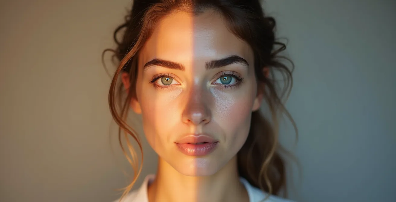
The visual above demonstrates this principle perfectly. The same cool-toned skin appears radiant and clear under the influence of cool light, but dull and discolored when reflecting warm, golden light. This is precisely why a Cool Winter should treat any warm-toned color, especially one as dominant as mustard yellow, with extreme caution when worn near the face.
If you love warmer yellows, they don’t have to be banished entirely, but they must be handled strategically. The following checklist provides a clear plan for navigating yellows while protecting your cool complexion.
Your Action Plan: The Cool Winter’s Guide to Yellow
- Choose the Right Hue: Actively replace any mustard yellow with ‘Winter Lemon’—a bright, clear yellow that shares your palette’s crispness.
- Place it Strategically: Wear challenging colors like chartreuse as an accent away from your face, such as in a skirt, trousers, or a handbag.
- Use it in Prints: If you love a print that contains mustard, ensure it is dominated by a cool-toned background like navy, black, or crisp white to neutralize its effect.
- Accessorize Wisely: Opt for accessories in warmer tones (like shoes or a portfolio) rather than clothing like scarves or blouses that sit directly against your face and neck.
- Prioritize Coolness: When in doubt, always default to the clear, cool yellows that harmonize with, rather than fight against, your natural coloring.
By understanding the “why” behind this color clash, you can confidently select the right shades of yellow that will add a pop of energy to your wardrobe without compromising your radiant complexion.
How to Adjust Your Hair Shade to Enhance Your Seasonal Palette?
Just as the right clothing color can illuminate your face, your hair color acts as a permanent frame for your complexion. For a Cool Winter, maintaining the correct undertone in your hair is paramount to a harmonious overall look. The most significant mistake is introducing warm tones—such as gold, copper, or auburn red—which directly clash with the cool, blue-based undertones of your skin. Even a subtle golden balayage or coppery highlights can create visual dissonance, making your skin appear ruddy or flushed and undermining the crispness of your Winter palette.
The goal is to select hair shades that share the same cool, ashen base as your skin. This means looking for colors described as “ash,” “cool,” or “natural” and avoiding anything labeled “golden,” “bronze,” or “warm.” For brunettes, this might mean a deep espresso with no red undertones, or a dark ash brown. For those with lighter hair, a platinum or ash blonde is far more flattering than a golden or honey blonde.
Professional colorists achieve this by using specific formulations to counteract warmth. As one professional guide on the True Winter palette notes, the key is communication with your stylist to ensure an “ash-based color.” A skilled colorist will use additives with blue or green pigments to neutralize any unwanted orange or red tones that naturally occur when lifting hair color. This is particularly important for techniques like highlights. A high-contrast “money piece” in a cool tone works beautifully for a Winter, whereas a blended, warm balayage can muddy their natural clarity. Using violet-based toning shampoos for blondes and blue-based for brunettes is also essential for at-home maintenance between salon visits, preventing the cool tones from fading and allowing warmth to creep back in.
By ensuring your hair color is in complete harmony with your cool undertones, you create a powerful and cohesive look where every element works together to enhance your natural, striking beauty.
The Color Mistake That Makes You Look Tired on Video Calls
In our increasingly digital world, looking your best on screen has become a new sartorial challenge. If you’ve ever felt that you look washed out or tired on video calls despite feeling fine, the culprit may be your color choice. Webcams and digital screens are notoriously poor at rendering color accurately. In fact, digital display research indicates that webcams can reduce color saturation by up to 30%. This compression has a devastating effect on mid-tone, muted colors.
For a Cool Winter, this means that colors which might look acceptable in person, such as heather grey, beige, or dusty rose, become “greyed out” on screen. The low saturation of the color, combined with the camera’s compression, strips the hue of its character, making it appear drab and, by extension, making you look drained and fatigued. The digital environment demands a different strategy—one that favors high saturation and clear contrast to combat the flattening effect of the camera.
To appear vibrant and defined on video calls, a Cool Winter should lean into the most powerful colors of their palette. Here are some key strategies:
- Wear Saturated Colors Near the Face: Choose tops or scarves in highly saturated Winter colors like cobalt blue, fuchsia, emerald green, or a true, crisp white. These strong colors hold up well against camera compression.
- Control Your Background: Position yourself in front of a neutral, cool-toned background. A busy or warm-toned background can cause the camera’s auto-balance to misread your skin tone.
- Define Your Features: The camera can flatten facial features. Applying a clear, cool-toned lipstick in a berry or blue-red shade provides instant definition and contrast that reads beautifully on screen.
- Avoid Mid-Tone Muted Colors: Consciously avoid wearing mid-range, low-saturation colors like soft greys, beiges, or muted pastels as your main top. These are the colors most likely to make you look washed out.
By making these simple yet strategic color choices, you can counteract the limitations of digital displays and ensure you project a clear, energetic, and polished image in every virtual meeting.
Why Navy Is a Better Base Color Than Black for Certain Skin Tones?
Black is the quintessential Winter color—a symbol of its high-contrast and dramatic nature. For many Winters, particularly Clear Winters, a sharp, true black is the ultimate power neutral, creating a crisp and defined silhouette. However, for other Winter sub-types, especially Deep Winters, an equally dark but slightly more complex neutral can be even more flattering: deep navy blue. While black is a complete absence of color, navy is a highly saturated, deep color that possesses a unique richness and dimension.
For a Deep Winter, whose natural coloring has immense depth but slightly softer contrast boundaries than a Clear Winter, pure black can sometimes be too stark. Navy harmonizes with their inherent depth, creating a sophisticated and powerful look that is less severe. For a Cool/True Winter, both neutrals work well, but navy offers more versatility. It pairs beautifully with the entire Winter palette, making jewel tones look richer and icy pastels appear even crisper.
This is not to say black should be avoided, but rather that navy should be considered an equally powerful—and sometimes superior—alternative for building a versatile and sophisticated wardrobe. The choice between them depends on your specific Winter sub-type and the effect you wish to achieve, as detailed in this comparative analysis of Winter subtypes.
| Winter Subtype | Black Effect | Navy Effect | Best Choice |
|---|---|---|---|
| Clear Winter | Creates sharp, defined contrast | Softens slightly, still maintains contrast | Black for maximum impact |
| Deep Winter | Can be too stark on softer features | Harmonizes with natural depth | Navy for sophistication |
| Cool/True Winter | Works well with high contrast | Adds dimension and complexity | Both work, navy more versatile |
By embracing navy as a core neutral, you add a layer of complexity and elegance to your style, proving that a powerful wardrobe is built on nuanced choices, not just absolutes.
Key takeaways
- Foundation matching for Winters is a science; test on the jawline and wait for oxidation to reveal the true, cool-toned color.
- The key to wearing pastels is “chromatic purity.” Choose icy, clear pastels like glacier blue and avoid muted, dusty tones like powder blue.
- Your Winter sub-season (Deep vs. Clear) is defined by your contrast level, which determines whether you shine in severe black or sophisticated navy.
Incorporating Trending Pantone Colors: How to Style Bold Hues for Office Wear?
One of the great joys of fashion is embracing new trends, but for a professional, it’s essential to do so in a way that feels polished and appropriate. For a Cool Winter, whose palette is naturally bold, incorporating a trending Pantone color can be seamless if done strategically. The key is to maintain the overall harmony of your look by following the 80/20 rule: keep 80% of your outfit in your classic, trusted Winter neutrals, and use the remaining 20% to introduce the trending color as a powerful accent.
This approach allows you to participate in the trend without letting it overwhelm your professional image. Your Winter neutrals—such as navy, charcoal grey, black, and crisp white—provide a sophisticated and stable foundation. The 20% accent can take the form of a silk blouse, a statement blazer, or even a simple shell top worn under a neutral suit. The nature of the trending color itself dictates its application. If the Pantone color of the year is a cool tone (like a periwinkle or a true red), it can be worn in larger pieces close to the face. If it is a warm tone, it should be limited to small accessories like a scarf, portfolio, or shoes, keeping it away from your complexion.
A perfect illustration of this strategy in action can be seen in how professional Winter types successfully integrated Pantone’s 2022 color, Very Peri. A Pantone integration case study showed how it was styled for the office.
Case Study: Successful Pantone Integration for Professional Winter Types
Professional women with Winter coloring successfully incorporated Pantone’s Very Peri (a periwinkle blue) in 2022 by using it in silk blouses worn under classic navy blazers. The cool undertone of the periwinkle harmonized perfectly with their palette while the blazer maintained office appropriateness. For a seamless transition to an evening event, removing the blazer and adding statement silver jewelry created an instant transformation from boardroom-ready to after-hours sophistication.
By using your powerful neutral base to ground trending colors, you can remain stylishly current while always looking polished, authoritative, and perfectly in harmony with your stunning Winter palette.