The secret to a spacious small apartment isn’t adding mirrors—it’s mastering its invisible architecture by controlling flow, perception, and psychology.
- Visual noise, not just clutter, is the primary source of claustrophobia.
- Strategic lighting and rugs can create distinct “rooms” without building a single wall.
- The path of movement, or “circulation,” dictates spatial freedom more than furniture size.
Recommendation: Stop thinking about what to remove and start thinking about how to direct the eye and the body through your space.
Living in a small apartment, especially one around 500 square feet, often feels like a constant battle against the walls closing in. The conventional wisdom is always the same: hang more mirrors, paint everything white, and buy furniture that folds. While these tips offer some relief, they are merely visual tricks. They are surface-level fixes for a problem that is fundamentally spatial and psychological. They treat the symptom—the feeling of being cramped—without addressing the root cause: a layout that works against human nature.
The true art of micro-living goes beyond simple decoration. It involves understanding the invisible forces that shape our experience of a room. These are the principles an architect uses to make a space feel not just bigger, but also calmer, more functional, and intuitively right. It’s about choreographing movement, managing what the eye sees (and what it doesn’t), and tapping into the primal parts of our brain that seek comfort and security in our environment. It’s about crafting a layout that manages visual noise, defines zones without walls, and respects the natural circulation flows of the inhabitants.
But what if the real problem isn’t the square footage, but a layout that creates subconscious stress and blocks natural movement? This guide moves past the platitudes. We will deconstruct the architectural and psychological principles that transform a compact apartment from a container into a sanctuary. We will explore how to manage circulation, leverage vertical space with intention, and make structural and furniture choices that enhance, rather than hinder, your daily life. This is about designing a home that feels expansive because it understands you.
To guide you through this architectural approach to small-space living, this article is structured to build from foundational concepts to advanced psychological applications. Here is a look at the spatial strategies we will explore.
Summary: Rethinking Your Small Apartment’s Spatial DNA
- Why “Visual Noise” Is Making Your Small Apartment Feel Claustrophobic?
- How to Use Rugs and Lighting to Define Separate Rooms in a Studio?
- Murphy Bed vs Sofa Bed: Which One Maximizes Floor Space Without Sacrificing Sleep?
- The Layout Mistake That Blocks Circulation in Narrow Living Rooms
- When to Build Up: Using Vertical Space to Double Your Storage Capacity
- The Load-Bearing Wall Mistake That Can Collapse Your Renovation Project
- Why Sharp Angles in Furniture Can Subconsciously Increase Anxiety?
- Interior Design Psychology: How to Create a Home That Reduces Stress Levels Daily?
Why “Visual Noise” Is Making Your Small Apartment Feel Claustrophobic?
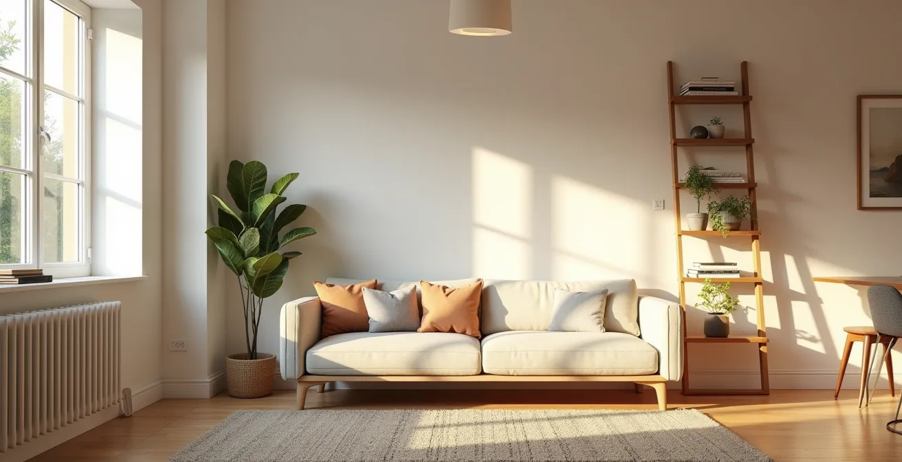
Before you even consider the physical layout, you must address the “visual noise.” This is not the same as clutter. A space can be perfectly tidy but still feel chaotic and small due to an overload of competing visual information. Visual noise is the result of clashing patterns, a fragmented color palette, exposed cables, and an over-density of small, unrelated objects. Each of these elements demands a small amount of cognitive energy, and in a compact apartment, the cumulative effect is a sense of being overwhelmed and boxed in. This mental load translates directly into a perception of a smaller, more stressful space.
The goal is to create a sense of visual calm, allowing the eye to rest. This doesn’t mean sterile minimalism; it means curating a cohesive visual story. Think of it as composing a photograph: you want a clear subject, not a dozen distracting elements fighting for attention. Start by unifying your textiles. A riot of different rug patterns, throw pillows, and curtains can make a room feel fractured. Instead, choose a coordinated scheme. The same principle applies to color. Limiting your primary palette to three or four complementary tones creates a serene backdrop that expands the space visually.
To reduce this noise, you can systematically audit your space for the main culprits:
- Pattern Competition: Replace textiles with clashing patterns (e.g., a geometric rug with floral cushions) with a coordinated color and texture story.
- Palette Fragmentation: If your room has more than four dominant, uncoordinated colors, it’s likely creating visual noise. Consolidate around a core palette.
- Line-Item Chaos: The “spaghetti” of exposed cables and the jumble of different furniture leg styles create distracting lines. Conceal wires and aim for furniture with similar leg profiles (e.g., all tapered, all block).
- Object Density: A multitude of small decorative items scattered around is a classic source of noise. Group them into intentional clusters of three or five, or better yet, store them in elegant closed containers.
By quieting this visual chatter, you’re not just tidying up; you’re creating the foundational canvas upon which a smart layout can truly shine. It gives your mind the “space” to perceive the room as larger.
How to Use Rugs and Lighting to Define Separate Rooms in a Studio?
In a studio or open-plan apartment, the greatest challenge is creating functional separation without erecting walls that block light and shrink the perceived volume. The architect’s solution is “zoning”: using visual cues to delineate different areas for living, sleeping, and working. Rugs and lighting are your most powerful, non-structural tools for this task. They create “rooms within a room” by establishing clear boundaries on the floor and from the ceiling, guiding both the eye and the body.
A common mistake is using a rug that’s too small, making it look like a postage stamp in the middle of the floor. Instead, use a large rug to define an entire primary zone, like the living area. All the furniture for that zone (sofa, coffee table, accent chairs) should have at least its front legs on the rug. This creates a unified “island” that feels intentional and grounded. For secondary zones, like a reading nook or workspace, you can use smaller, coordinated rugs to create an “archipelago,” visually separating them from the main living space.
Lighting works in a similar way but in three dimensions. Instead of a single, harsh overhead light, layer your lighting to create distinct atmospheres. This is a technique called light zoning. Use a warm, low-level pendant light over the dining area, a focused task lamp at your desk, and soft, ambient floor lamps in the living area. The temperature of the light is also a powerful tool. A warmer color temperature (around 2700K) can signify a rest zone like the sleeping area, while a cooler, brighter light (around 4000K) is better for a work zone, signaling to your brain a shift in function.
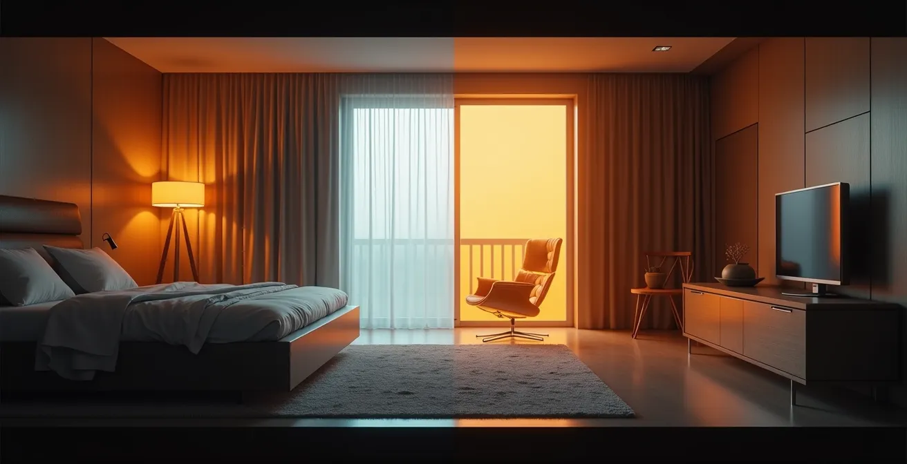
This image perfectly illustrates the power of light zoning. Notice how the stark contrast between the warm, amber glow of the sleeping area and the crisp, white light of the work zone creates an invisible, yet clearly felt, boundary. It’s a cinematic approach that carves out distinct functional and emotional spaces from a single room.
Case Study: The Hollywood Studio Transformation
A design team took on the challenge of a 500 sq. ft. Hollywood studio and successfully created over seven distinct functional zones. According to the project details on Style by Emily Henderson, they used the “island” and “archipelago” rug method described above. A single large rug anchored the main seating area, while a constellation of smaller, coordinated rugs defined the entryway, a small workspace, and a reading nook, proving that strategic floor coverings can dramatically multiply a studio’s functionality.
Murphy Bed vs Sofa Bed: Which One Maximizes Floor Space Without Sacrificing Sleep?
In the quest for the ultimate space-saving solution, the battle between the Murphy bed and the sofa bed is legendary. While both promise to return valuable floor space during the day, they offer fundamentally different approaches to spatial efficiency and comfort. A sofa bed offers dual utility in a single footprint, but that footprint is permanent. A Murphy bed, on the other hand, offers a more radical transformation: the complete disappearance of the bed, freeing up nearly 100% of its floor space for other activities.
The decision often comes down to a trade-off between convenience, sleep quality, and cost. Sofa beds are generally cheaper and require no installation, but they almost always compromise on sleep quality. The folding mechanism necessitates a thinner, often less supportive mattress. A Murphy bed, by contrast, accommodates a standard, full-thickness mattress, offering uncompromised sleep comfort. The transition time is also a key factor; a modern Murphy bed can often be deployed in under 30 seconds with one hand, whereas unfolding a sofa bed can be a multi-step process.
The following table breaks down the key differences, drawing from comparative analyses of space-maximizing furniture.
This comparison, based on data from sources like a recent analysis on transformer furniture, highlights the core trade-off: a sofa bed is a compromise, while a Murphy bed is a transformation.
| Feature | Murphy Bed | Sofa Bed |
|---|---|---|
| Transition Time | 30 seconds, one-handed | 2-3 minutes, multi-step |
| Daytime Floor Space | 100% available for other uses | Always occupied by sofa |
| Sleep Quality | Full mattress support | Compromised by fold mechanism |
| Installation Cost | $2,000-$5,000 | $400-$1,500 |
| Versatility | Space becomes gym/office/dining | Limited to seating/sleeping |
Case Study: The Integrated Transformer Desk-Bed
Modern systems have evolved far beyond the basic wall bed. Brands like Clei offer fully integrated furniture systems that combine a bed, desk, and storage into one seamless unit. In one documented 400 sq. ft. NYC apartment, a system was installed where the desk remains perfectly horizontal—with everything still on it—as the bed folds down over it. This eliminates the daily chore of clearing a workspace, representing the pinnacle of spatial efficiency and transformable design.
The Layout Mistake That Blocks Circulation in Narrow Living Rooms
The single most common and detrimental layout mistake in any small space, particularly narrow ones, is ignoring circulation. Circulation refers to the natural pathways people use to move through a room—the “desire lines” from the door to the window, the kitchen to the sofa, or the bedroom to the bathroom. Placing furniture, even a small side table or the corner of a rug, directly on these paths creates a physical and psychological obstruction. It forces you to constantly weave and sidestep, making the entire space feel cramped, awkward, and fundamentally smaller than it is.
Think of your apartment’s circulation paths as rivers. They need to flow freely. The goal is to arrange your furniture on the “banks” of these rivers, not in the middle of the current. A classic error is pushing all furniture against the walls in a long, narrow room, creating a “bowling alley” effect. This actually constricts the central walkway. A counter-intuitive but effective strategy is to “float” your main sofa, pulling it 4-6 inches away from the wall. This small gap creates breathing room and allows for a clearer, more generous-feeling circulation path behind it.
Maintaining adequate clearance is a non-negotiable architectural standard. While the average US apartment size is around 882 square feet, these clearance principles are even more critical in spaces half that size. Adhering to these minimum dimensions is the difference between a layout that flows and one that fights you at every turn.
Your Action Plan: Audit Your Circulation Clearances
- Major Walkways: Grab a tape measure. The main paths through your home (e.g., from the front door to the main living area) must have a minimum clearance of 30-36 inches. Anything less will feel like a bottleneck.
- Coffee Table to Sofa: Check the distance between your coffee table’s edge and the sofa. It should be 14-18 inches—enough for leg room, but close enough to reach.
- Chair Pull-Out Space: Walk to your dining or desk chair. You must have at least 24 inches of clear space behind it to comfortably pull it out and sit down.
- Floating Furniture: If you have a long room, pull your sofa off the wall. Verify you have 4-6 inches of “breathing room” behind it to avoid the dreaded “bowling alley” look.
- Map Desire Lines: Stand at your front door. Mentally trace the path you take to the kitchen. Now trace your path from the sofa to the window. Is there any furniture obstructing these natural lines? If so, it must be moved.
When to Build Up: Using Vertical Space to Double Your Storage Capacity
The advice to “use vertical space” is a classic for small apartments, but it’s often applied crudely, resulting in towering, oppressive shelves that make a room feel top-heavy and cavernous. The architectural approach is more nuanced: it’s about creating a deliberate vertical storage hierarchy. This means treating your walls like a three-tiered landscape: a high-access zone for deep storage, a mid-level zone for daily items, and a low-level zone that integrates with your furniture.
The key to successful vertical storage is visual integration. Floor-to-ceiling shelving can be incredibly effective, but only if it recedes visually. Painting the shelves the exact same color as the wall behind them is a powerful technique. This tricks the eye into perceiving the shelving as part of the architecture, rather than a bulky piece of furniture. It provides massive storage capacity without visually encroaching on the room’s precious volume. Conversely, a contrasting color will make the unit “pop,” which can be a great accent on a feature wall but can feel overwhelming in a small space.
The texture and form of your vertical storage also play a critical role in managing visual noise. A system that mixes open shelves with closed cabinets and woven baskets offers both display opportunities and the ability to hide less sightly items, creating a balanced composition.

As seen in this detailed view, the interplay of textures—the warm wood grain, the natural weave of a basket, the smoothness of ceramic—adds depth and interest to a vertical storage system. This tactile quality prevents a large shelving unit from feeling monolithic and flat, turning a functional element into a rich, sensory feature.
Case Study: The IKEA BILLY Transformation
In a well-documented makeover of a 470 sq. ft. studio, designer Ashley used standard IKEA BILLY bookcases to create an entire wall of floor-to-ceiling storage. The crucial step, as featured on Apartment Therapy, was painting the bookcases in Behr’s “Pink Taffy” to perfectly match the wall color. This made the massive storage unit feel like a custom built-in, visually receding into the wall and preventing the room from feeling crowded while effectively dividing the space.
The Load-Bearing Wall Mistake That Can Collapse Your Renovation Project
For the ambitious small-space dweller, the ultimate dream is often to knock down a wall to create a more open, fluid layout. However, this is the one area where a mistake is not just costly, but potentially catastrophic. Misidentifying a load-bearing wall—one that supports the structural weight of the floors above or the roof—and attempting to remove it without proper engineering can lead to sagging floors, cracked walls, and in the worst-case scenario, partial or total collapse. No amount of open-plan bliss is worth that risk.
Before you even pick up a sledgehammer, you must learn to identify the potential signs of a load-bearing wall. While the only way to be 100% certain is to consult original building plans or a structural engineer, there are several non-destructive clues you can look for. Load-bearing walls are often, but not always, located centrally in the building’s footprint, as they are key to distributing weight. They are also typically thicker than simple partition walls. If you have access to a basement or attic, look for steel I-beams or substantial wooden beams that run directly into the top or bottom of the wall in question; this is a strong indicator of its structural role.
Here are some key steps to take before considering any demolition:
- Central Location: Check if the wall runs perpendicular to the floor joists above. This is a common characteristic of a load-bearing wall.
- Wall Thickness: Measure the wall’s thickness. In modern construction, a standard non-load-bearing wall is about 4.5 inches thick (drywall on either side of a 2×4 stud). A load-bearing wall may be 6 inches or thicker.
- Foundation Support: In the basement or crawl space, check if the wall is built directly on top of a foundation footing or a support beam.
- Consult Plans: The most reliable step is to obtain the original architectural or structural plans for your building from your city’s records office or building management.
Case Study: The Cased Opening Compromise
What if the wall is load-bearing? You’re not out of options. As shown in a clever renovation featured by Apartment Therapy, homeowners can create a wide “cased opening.” This involves removing a large portion of the wall but leaving the structural columns on the sides and installing a supportive header beam across the top. This achieves about 80% of the benefit of full removal—allowing light flow and a visual connection between spaces—while maintaining structural integrity at a fraction of the cost and complexity of a full structural rework.
Why Sharp Angles in Furniture Can Subconsciously Increase Anxiety?
Our brains are hardwired with ancient survival instincts. In nature, sharp, pointed objects—thorns, jagged rocks, animal teeth—represent a potential threat. This primal association carries over into our homes. Furniture with sharp 90-degree corners, especially when positioned along high-traffic routes, can create a subtle, low-level sense of anxiety. Your subconscious brain registers these corners as potential hazards, or “threat vectors,” that you must constantly navigate. This is particularly true for furniture that points directly at places of rest, like the corner of a coffee table aimed at the sofa or a nightstand corner pointed at your bed.
This doesn’t mean your home needs to be entirely composed of circles. The solution is to be mindful of where these sharp angles are located and to favor softer forms in key areas. Opting for furniture with rounded, chamfered, or beveled edges can make a significant difference in the psychological comfort of a room. A round coffee table is often a better choice for a small living room than a square or rectangular one, as it has no sharp corners to jab shins and it improves circulation flow around it. Similarly, choosing a sofa with soft, rounded arms can make the entire space feel more inviting and less aggressive.
You can perform a “threat pathway audit” of your own space to identify and mitigate these subconscious stressors. This involves mapping your most-used routes and identifying any sharp corners that intersect them.
- Map High-Traffic Paths: Trace your daily routes from the bed to the bathroom, the sofa to the kitchen.
- Identify Threat Vectors: Look for any sharp furniture corners that point directly at your main seating or sleeping areas.
- Rotate and Replace: Can you rotate a piece of furniture to point the corner at a wall instead of a person? If not, consider replacing a key piece, like a sharp-edged coffee table, with a rounded alternative.
- Choose Softer Edges: When buying new furniture, actively look for pieces with chamfered or beveled edges over stark 90-degree angles.
- Position Rounded Items on Routes: Place your roundest, softest furniture items along the main circulation routes to create a smoother, safer-feeling journey through the space.
By softening the edges in your home, you’re sending a powerful signal to your subconscious brain: this is a safe, comfortable space. It’s a subtle shift that can have a profound impact on your daily stress levels.
Key takeaways
- True spaciousness comes from psychological comfort, not just visual tricks.
- Mastering circulation, zoning, and visual noise are the three pillars of small-space architecture.
- Your home’s layout should support your well-being by providing both open sightlines (prospect) and secure nooks (refuge).
Interior Design Psychology: How to Create a Home That Reduces Stress Levels Daily?
Ultimately, optimizing a small apartment is an exercise in applied psychology. Every layout decision influences your mood, stress level, and sense of well-being. A truly successful small space is one that feels like a sanctuary, a place of refuge from the outside world. Two powerful psychological concepts can help achieve this: Prospect-Refuge Theory and Biophilic Design.
Prospect-Refuge Theory posits that humans are instinctively drawn to environments where they can see without being seen. This comes from our evolutionary need to spot predators (prospect) from a safe, protected position (refuge). In your apartment, this means creating cozy, sheltered nooks (a high-backed armchair in a corner, a bed with a solid headboard against a wall) that still offer a clear view of the room’s entrance and windows. This arrangement satisfies a primal need for security and can significantly reduce subconscious stress.
Biophilic design builds on this by tapping into our innate connection to nature. It involves incorporating natural elements to create a calming, restorative environment. This goes far beyond just adding a few houseplants. It’s about integrating a variety of natural materials, patterns, and sensory experiences.
- Direct Connection: This is the most obvious form—adding plants, a small water feature for soothing sound, and maximizing natural light.
- Indirect Connection: Use materials and patterns that evoke nature. This includes furniture made from natural wood, textiles like linen and wool, stone countertops, and patterns that mimic natural fractals (like leaf veins or snowflakes).
- Human-Space Response: This ties back to prospect-refuge. It’s about creating a dynamic space with both open, expansive areas for socializing and sheltered, cozy zones for quiet retreat.
- Acoustic Comfort: Nature is rarely silent, but it’s also rarely harsh. Layering rugs, curtains, and soft furnishings absorbs sound, preventing the sharp echoes common in small, hard-surfaced apartments and creating a softer acoustic environment.
- Tactile Grounding: Mix a variety of textures—the roughness of a stone coaster, the smoothness of a wooden table, the softness of a velvet cushion. This sensory variety provides tactile grounding and enriches the experience of the space.
Case Study: Prospect-Refuge in a 40 sqm Apartment
In a 40-square-meter apartment designed by Colin Chee, the principles of prospect-refuge were explicitly applied. A high-backed chair was deliberately positioned in a corner, providing a secure “refuge” for the inhabitant. From this single point, the resident has clear sightlines to the apartment entrance and the main windows. This simple arrangement, highlighted in analyses of the project on platforms like Gents Cafe, was reported to dramatically reduce feelings of vulnerability and improve the overall sense of security and calm within the compact home.
By shifting your focus from purely aesthetic tricks to these deeper architectural and psychological strategies, you can unlock the true potential of your home, making it a place that not only looks bigger but feels fundamentally better to live in.