Creating a calm home isn’t about choosing ‘calm’ colors, but about mastering how light and texture interact to reduce your brain’s cognitive load.
- A color’s true nature is revealed by the light in your room (a phenomenon called metamerism), not the paint chip.
- The paint’s finish (matte vs. eggshell) has a profound impact on a room’s perceived luxury and emotional tone, often more so than the color itself.
Recommendation: Focus on creating a cohesive visual journey with a limited, low-contrast palette and curved forms to achieve genuine, stress-reducing tranquility.
The quest for a tranquil home often begins with a trip to the paint store. We stand before a wall of a thousand shades, armed with the common wisdom that soft blues and gentle greens will magically transform our chaotic living rooms and bustling kitchens into serene sanctuaries. We’re told to build mood boards, to follow the 60-30-10 rule, and to hope for the best. Yet, too often, the result feels flat, or worse, the “calm” white we chose mysteriously glows a sickly yellow under our evening lamps.
This happens because conventional advice focuses on the *what*—the colors themselves—while ignoring the far more crucial *why* and *how*. The true art of creating an emotionally resonant space lies not in a simple color-emotion dictionary, but in understanding the subtle psychology of perception. It’s a dance between light, texture, and the very geometry of our rooms.
But what if the key to a stress-free home wasn’t about picking a color, but about managing the cognitive load it places on our brains? This guide moves beyond the surface-level platitudes. We will explore the scientific and psychological principles that govern how we experience color in a three-dimensional space. We’ll uncover why a finish can be more powerful than a hue, how light plays tricks on our eyes, and how the shapes in our rooms can either heighten or soothe our subconscious anxiety. It’s time to learn how to design not just for aesthetics, but for the mind.
This article provides a comprehensive look into the psychology of color and space. Below is a summary of the topics we will explore, designed to guide you from basic principles to advanced application for a truly serene home.
Summary: Mastering the Art and Science of a Calming Color Palette
- Why Painting Your Kitchen Blue Might Suppress Your Appetite?
- How to Transition Colors Between Open-Plan Zones Without Clashing?
- Matte vs Eggshell: Which Finish Makes Dark Colors Look Luxurious?
- The “White Paint” Mistake That Makes Your Walls Look Yellow
- When to Swatch: The Time of Day That Reveals the True Color
- Why Sharp Angles in Furniture Can Subconsciously Increase Anxiety?
- Why Wearing Bright Red to a Negotiation Might Backfire?
- Interior Design Psychology: How to Create a Home That Reduces Stress Levels Daily?
Why Painting Your Kitchen Blue Might Suppress Your Appetite?
The association of blue with calmness is one of the most well-known tenets of color psychology. It evokes images of serene skies and tranquil oceans, making it a popular choice for bedrooms and bathrooms. However, when this calming hue is brought into the kitchen, it can have an unexpected and often undesirable effect on our behavior. The reason is deeply rooted in our evolutionary instincts.
Historically, very few foods in nature are blue. The color is more often a sign of spoilage or poison, leading our brains to develop a subconscious aversion to it in a culinary context. This isn’t just folklore; scientific studies confirm the connection. For instance, research published in 2024 indicates that dining in blue environments can measurably reduce food consumption. The color acts as a natural appetite suppressant, which might be beneficial for some, but can make a family kitchen feel less inviting and convivial.
This doesn’t mean you must banish blue from your kitchen entirely. The key is strategic application. Instead of painting all four walls a dominant blue, consider using it as an accent. A tiled backsplash, a set of navy blue cabinets balanced with warm wood countertops, or accessories in shades of teal and aqua can provide the color’s clean, fresh aesthetic without dampening appetites. The goal is to create a chromatic dialogue where blue contributes to the room’s character without overwhelming its primary function: to be a warm and welcoming hub for nourishment and gathering.
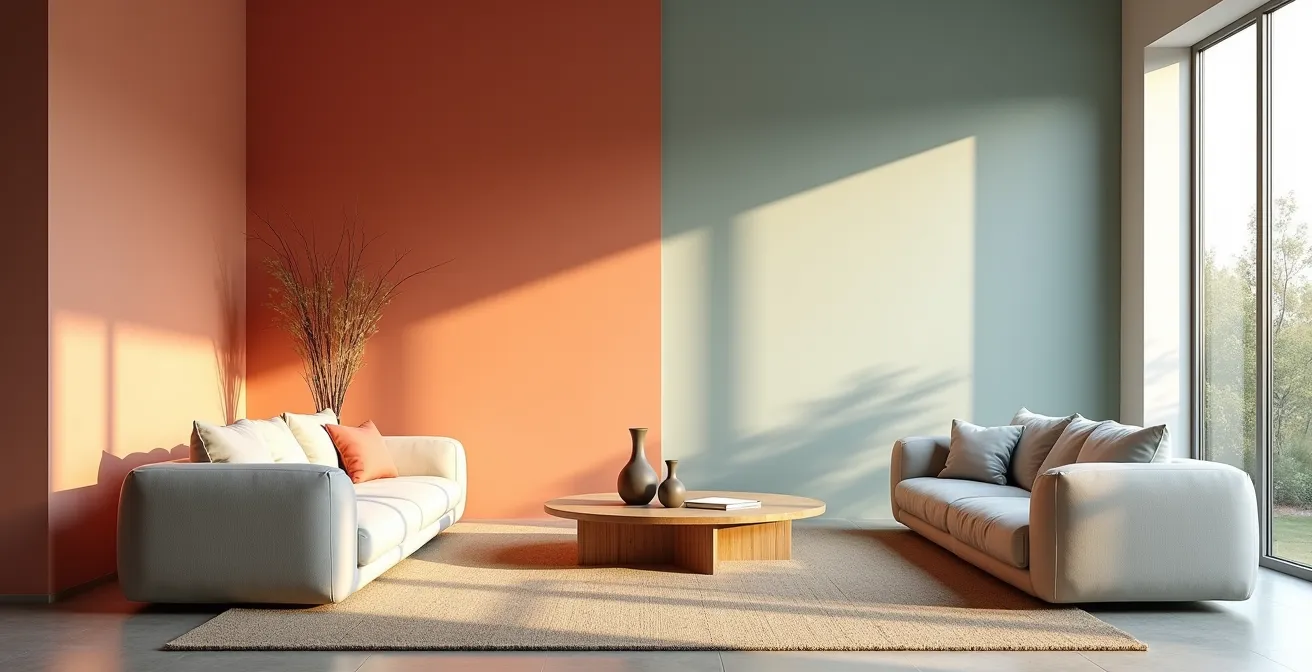
How to Transition Colors Between Open-Plan Zones Without Clashing?
Open-plan living presents a unique chromatic challenge: how do you define distinct zones—living, dining, cooking—without building walls, all while maintaining a cohesive and harmonious visual flow? The answer lies in creating intentional color bridges rather than abrupt shifts. A sudden change from a warm beige to a cool gray can feel jarring, increasing the cognitive effort required to process the space and creating a subtle sense of disarray.
As shown in the image above, the most effective technique is to find or create an element that contains the colors of both zones. This could be a large area rug, a piece of artwork, or a textile pattern that weaves the hues together. This “bridging” element gives the eye a logical path to follow, making the transition feel natural and deliberate. Another sophisticated approach is to use a neutral “transitional” color on a shared wall, a shade that contains undertones of the colors from both adjacent zones, like a greige that connects a beige and a gray area.
As the RMCAD Interior Design Department notes in their analysis of color theory, designers often favor colors that are neighbors on the color wheel for this very reason. They state, “Blue and green, in particular, are favored for calming spaces, as they create a harmonious effect and can be cohesive even without the extensive use of neutrals.” This principle of using analogous colors creates an inherent sense of order, allowing one color to flow gracefully into the next, which is the cornerstone of creating a calming, unified open-plan environment.
Matte vs Eggshell: Which Finish Makes Dark Colors Look Luxurious?
When working with dark, dramatic colors like charcoal gray, navy blue, or forest green, the choice of paint finish is just as critical as the hue itself. The same color can appear either profoundly luxurious or disappointingly flat depending on its sheen. The secret to achieving that coveted, high-end look lies in understanding how finish affects light and perception. The undisputed champion for making dark colors feel opulent is a matte finish.
A matte finish absorbs a significant amount of light, minimizing reflections and creating a soft, velvety surface. This lack of sheen allows the pure pigment of the color to come forward, imbuing the space with a sense of depth and richness. The surface seems to recede, making the room feel more intimate and sophisticated. In contrast, a finish with more sheen, like eggshell or satin, reflects light. On a dark color, this can create distracting hotspots and highlight even the slightest imperfections on the wall, cheapening the overall effect.
This table, based on an analysis of interior design principles, breaks down the visual impact of different finishes on dark colors.
| Finish Type | Light Absorption | Visual Effect | Best Use Case |
|---|---|---|---|
| Matte | Maximum (95%) | Velvety, depth-creating | Main walls for luxury feel |
| Eggshell | Moderate (60-70%) | Subtle sheen, slight reflection | Trim and accent walls |
For a truly sophisticated application, designers use a technique called “finish blocking.” This involves painting the main walls in a matte finish and then using the exact same color in an eggshell or satin finish for the trim, doors, and baseboards. The subtle shift in sheen creates a layered, textural effect that reads as intentional and luxurious, adding depth without introducing a new color and thus keeping the cognitive load low.
Action Plan: The Finish Blocking Technique
- Apply matte finish to main wall surfaces for maximum light absorption and a velvety texture.
- Use an eggshell or satin finish on all trim, baseboards, and doors in the exact same color as the walls.
- Observe how the varying sheen levels create subtle depth and architectural interest without adding visual clutter.
- Test your chosen finishes at multiple times of day to see how natural and artificial light interact with the different sheens.
- Consider the room’s orientation; a north-facing room with flat light will benefit more from this technique than a sun-drenched south-facing room.
The “White Paint” Mistake That Makes Your Walls Look Yellow
There is no single color that causes more decorating frustration than white. You select a swatch that appears pure and crisp at the store, only to find it looks dingy, gray, or, most commonly, yellow on your walls. This isn’t a problem with the paint; it’s a classic case of metamerism, a phenomenon where a color appears to change under different light sources.
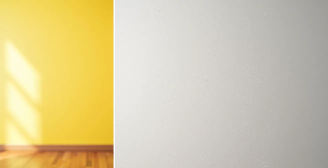
As the visual comparison shows, the same white surface can look dramatically different depending on the light hitting it. Your home’s light is a complex mix of natural light from windows and artificial light from bulbs, and each has a unique “color temperature.” Natural light changes throughout the day, being cool and blue-toned in the morning and warm and yellow-toned in the late afternoon. Artificial bulbs add another layer of complexity. For instance, research shows that some 30% of a warm white’s appearance can be distorted by the wrong type of artificial light, such as a cool-toned LED bulb. A warm white (with yellow or pink undertones) paired with warm incandescent light will look cozy, but that same white under a cool fluorescent light can look sickly and green.
The common mistake is choosing a white based on its undertone in isolation. The “right” white is not the one with the “right” undertone, but the one whose undertone balances the dominant light temperature in your room. For a north-facing room with cool, gray light, a pure white can look sterile; a white with a hint of a warm undertone (cream or beige) is needed to add life. Conversely, in a very sunny, south-facing room, a warm white can become overwhelmingly yellow; a cooler white with blue or gray undertones will balance the intense sunlight and appear as a neutral white.
When to Swatch: The Time of Day That Reveals the True Color
Given the powerful effect of light on color perception, the act of “swatching” becomes the most critical step in choosing a paint. However, simply painting a small square on the wall and making a decision is not enough. To truly understand how a color will live in your space, you must observe it as a dynamic element that changes with the light. The key is to test the color at specific times that correspond to how you use the room.
The ideal process involves painting a large sample, at least two-by-two feet, or painting a large poster board that can be moved around the room. You must then observe this swatch at three key moments: in the morning light (often cool and clear), at midday (when the light is brightest and truest), and in the evening with all your artificial lights on. An earthy beige that looks perfect in the warm afternoon sun might turn into a dull, flat mud color under your cool LED recessed lighting at night. It’s during this evening check that many color mistakes are revealed.
This process of observation is about more than just accuracy; it’s about emotion. As the experts at Ron Scott Design Build point out, the science of color must ultimately serve the human experience.
A color might look beautiful on a swatch but feel off in your home. Lighting, undertones, finishes, and even your flooring affect how a color actually reads. The ‘right’ color feels good to live with, not just good to look at.
– Ron Scott Design Build, Ron Scott Design Build – Certified True Colour Expert
This emphasizes that the goal isn’t to find a theoretically “perfect” color, but to find the color that consistently feels right and supports the desired mood within the unique ecosystem of your home’s light and architecture.
Why Sharp Angles in Furniture Can Subconsciously Increase Anxiety?
The psychology of creating a calm space extends beyond color to the very shapes that furnish it. Our brains are wired to react differently to curves and sharp angles, a response rooted in primal survival instincts. Sharp, pointed objects in our environment—from the corner of a table to the silhouette of a modern armchair—can be subconsciously perceived as potential threats. This isn’t a conscious fear, but a low-level, continuous alert.
This phenomenon is part of a field known as neuro-aesthetics. Studies in this area have shown that the visual processing of sharp angles can trigger a subtle stress response in the brain’s amygdala, the region associated with fear and anxiety. In fact, some neuroscience research shows that viewing angular designs can lead to a minor but measurable increase in cortisol, the body’s primary stress hormone. Over time, being constantly surrounded by these sharp geometries in a high-traffic area like a living room can contribute to a background hum of unease and anxiety.
The solution is to consciously introduce curved forms to soften the environment and counteract the inherent angles of a room’s architecture. This can be achieved through:
- Curved Furniture: A sofa with rounded arms, a circular coffee table, or an oval dining table can immediately reduce the room’s angularity.
- Softening Decor: Introducing round mirrors, circular rugs, and lighting with dome or globe shapes breaks up the hard lines of walls and ceilings.
- Organic Patterns: Textiles and wallpapers with flowing, biomorphic patterns can create a sense of natural movement and ease.
By balancing the necessary angles of our homes with soft, curved elements, we send a signal of safety and comfort to our brains, actively lowering stress levels and fostering a more restorative atmosphere.
Why Wearing Bright Red to a Negotiation Might Backfire?
The color red is a powerhouse of energy. It is the color with the longest wavelength, meaning it is the most stimulating for our eyes and brain. In nature, it signals ripeness, danger, and passion. In a negotiation, wearing red is often seen as a power move, projecting confidence and dominance. However, this same high-energy attribute, when translated into an interior space, can easily backfire if not handled with extreme care.
Introducing large amounts of bright red into a room—like painting an entire living room in crimson—can create an environment that is agitating rather than energizing. The color is known to physiologically increase heart rate and blood pressure. While this can be exciting in small doses, constant exposure can lead to feelings of restlessness, irritability, and even aggression. It puts the nervous system in a constant state of high alert, which is the antithesis of a calm and relaxing home environment.
The mistake is not using red, but overusing it. Red is most effective as an accent color, where its energy can be appreciated without becoming overwhelming. Think of it as a spice rather than the main course. A single red accent chair, a piece of vibrant abstract art, a collection of crimson cushions, or a patterned wallpaper on one feature wall can inject life and warmth into a neutral space. This strategic use of red provides a focal point and a burst of energy that draws the eye and enlivens the room, transforming it from drab to dynamic without inducing stress.
Key Takeaways
- The brain’s response to color is physiological; creating calm is about managing cognitive load, not just aesthetics.
- Light and finish are more critical than the color chip. Master metamerism and sheen levels to control a color’s true expression.
- Achieve tranquility through harmony and flow, using analogous palettes and curved forms to soften a space and reduce subconscious stress.
Interior Design Psychology: How to Create a Home That Reduces Stress Levels Daily?
We’ve explored the individual components—color, light, finish, and shape. Now, let’s synthesize these elements into a holistic strategy for creating a home that actively reduces stress. The ultimate goal is to design a sensory environment that lowers our cognitive load, allowing our minds to relax and restore. This is achieved not by following fleeting trends, but by applying timeless principles of interior design psychology.
The foundation of a low-stress environment is a limited and harmonious palette. Instead of a riot of competing colors, choose a maximum of three to four hues that work well together, such as an analogous or monochromatic scheme. Low-contrast combinations are easier for the brain to process. While general preferences exist—for example, research demonstrates that blue interiors are often regarded as ‘more likable’ than orange ones—the key is cohesion. Distribute these colors using the 60-30-10 rule (60% dominant color, 30% secondary, 10% accent) to create a clear visual hierarchy and a sense of predictable order.
This color strategy must be paired with a conscious approach to shape and texture. As we’ve seen, incorporating curved and organic forms through furniture and decor helps to mitigate the inherent anxiety produced by sharp architectural angles. Finally, to prevent the space from feeling monotonous, add one small, vibrant accent. This could be a single cushion, a vase, or a piece of art in a bold, contrasting color. This tiny splash of energy provides a focal point and prevents visual boredom without disrupting the overall tranquility. By thoughtfully combining these principles, you move from merely decorating a house to curating a true sanctuary.
Your home should be a refuge, a space that supports your well-being. By applying these psychological principles of color, light, and form, you can begin to transform your high-traffic areas from sources of chaos into havens of calm. Start today by analyzing one room’s light and geometry, and take the first step toward creating your personal sanctuary.
Frequently Asked Questions on Color Theory in Home Design
What time should I check paint swatches in north-facing rooms?
Check at 10 AM and 2 PM when natural light is most consistent, as north-facing rooms receive cool, even light throughout the day. This avoids the skewed perception from early morning or late afternoon light.
How does evening artificial light affect color perception?
Artificial lighting can significantly alter how a color appears, often shifting it by 20-40% from its appearance in daylight. Testing swatches in the evening with all your usual lights turned on is essential to avoid surprises.
Should I test swatches on multiple walls?
Yes, absolutely. The best method is to paint large poster boards and move them to different walls within the same room. This allows you to observe how the color interacts with varying light angles and reflects off adjacent surfaces, giving you the most accurate impression.